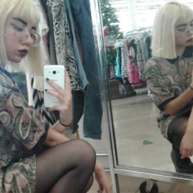
I don’t know what it is about pastels, but I have always been a fan. The softness of pastel colors can be both futuristic (in either a modern and retro way) or just plain retro, and always brings about a sense of calm. I even recently came to the realization through the process of decorating my flat that apart from black and white, I tend to decorate with pastels as these milky washed out tones relax my mind and leave me feeling grounded and at ease. (You may not believe me, but my penchant for pastels runs so deep that my modest blu-ray and book collection is driving me crazy due to their failure to fit into my strict color color palette.)
Aside from the calming effect pastels seem to have, I am in love with imagery they are often a part of. Whether they are found in the faded pink-toned photos, magazine pages, or video stills from the 60s, 70s, and 80s, adorning the signs and structures of faded buildings and signs, or married to graphic and modern geometric scenes in photographs of architecture or as part of modern art installations, I can’t seem to get enough. (Which is probably why I was to obsessed with Spank! when I first learned of this 80s candy-colored pop culture fashion tribute from the streets of Shibuya.)
If you are like me and can’t get enough of pastel tones or these images, then be sure to check out infusedwithpastels for your pastel fix.
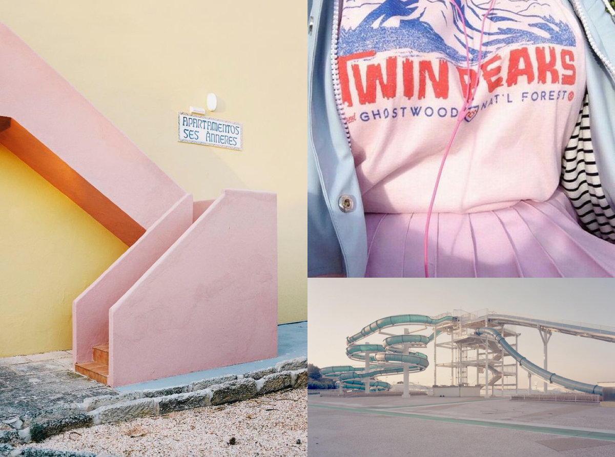
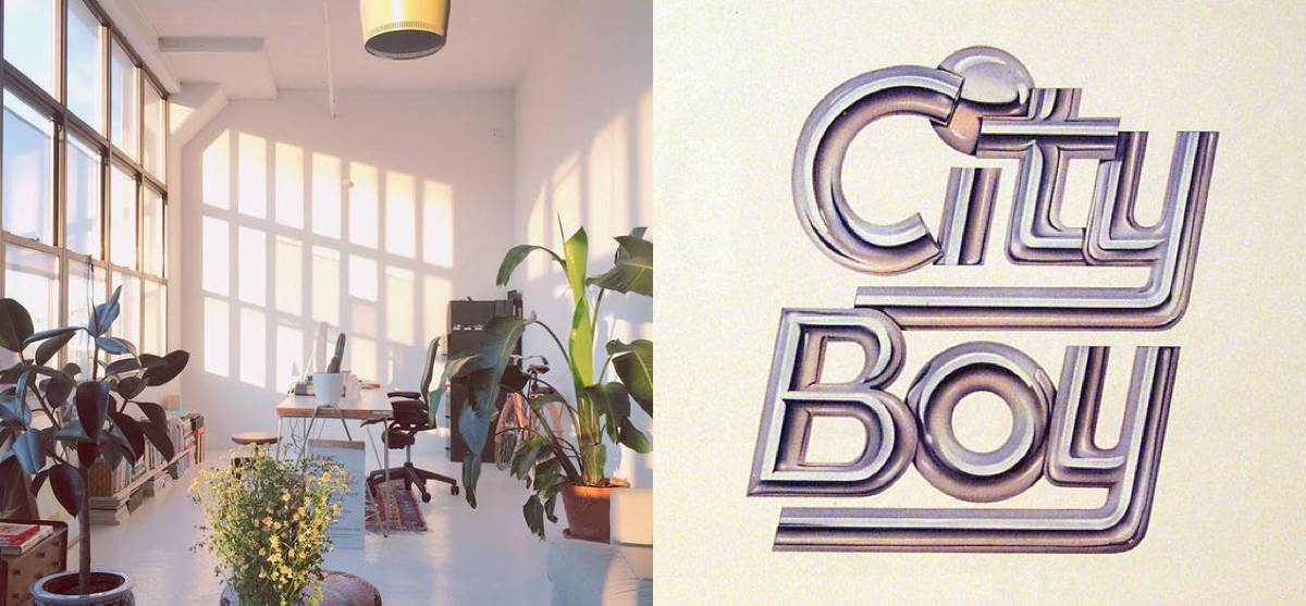
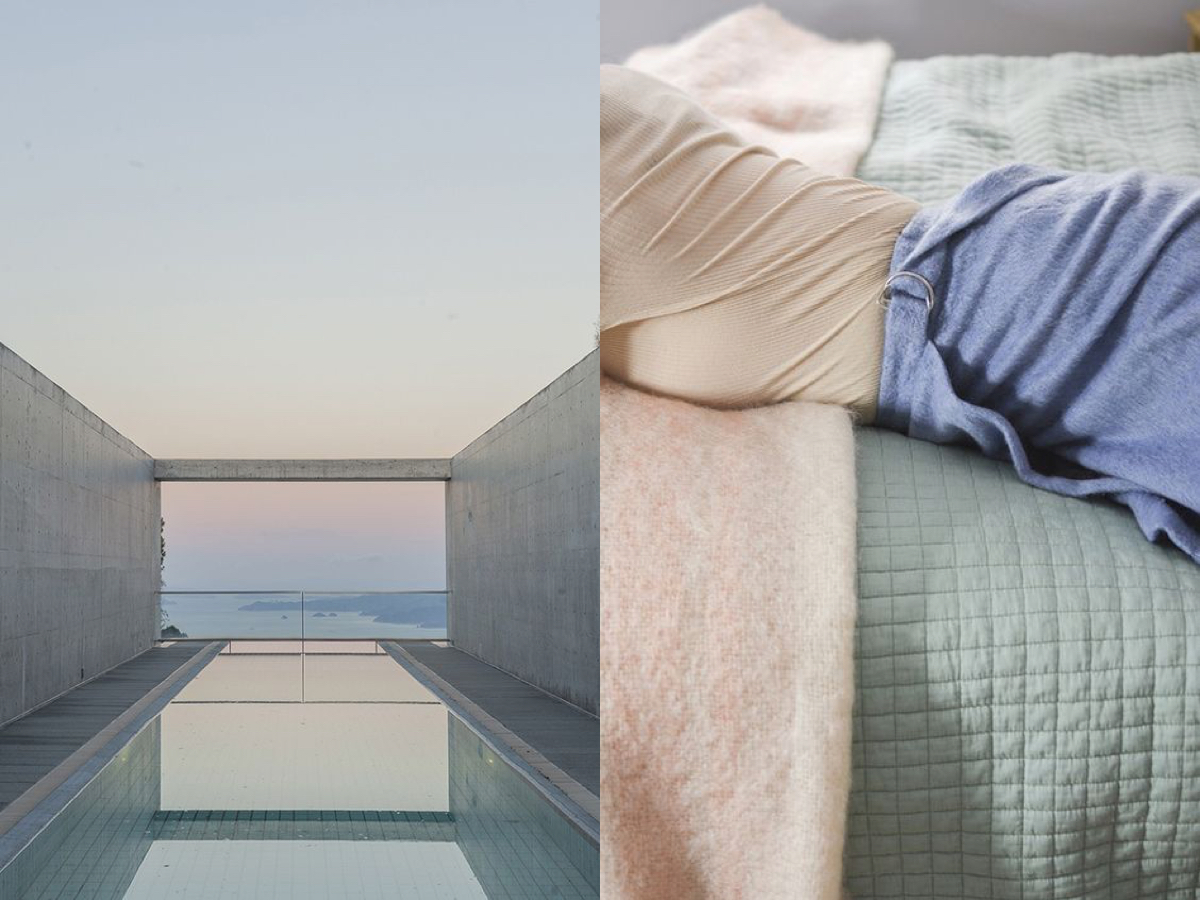
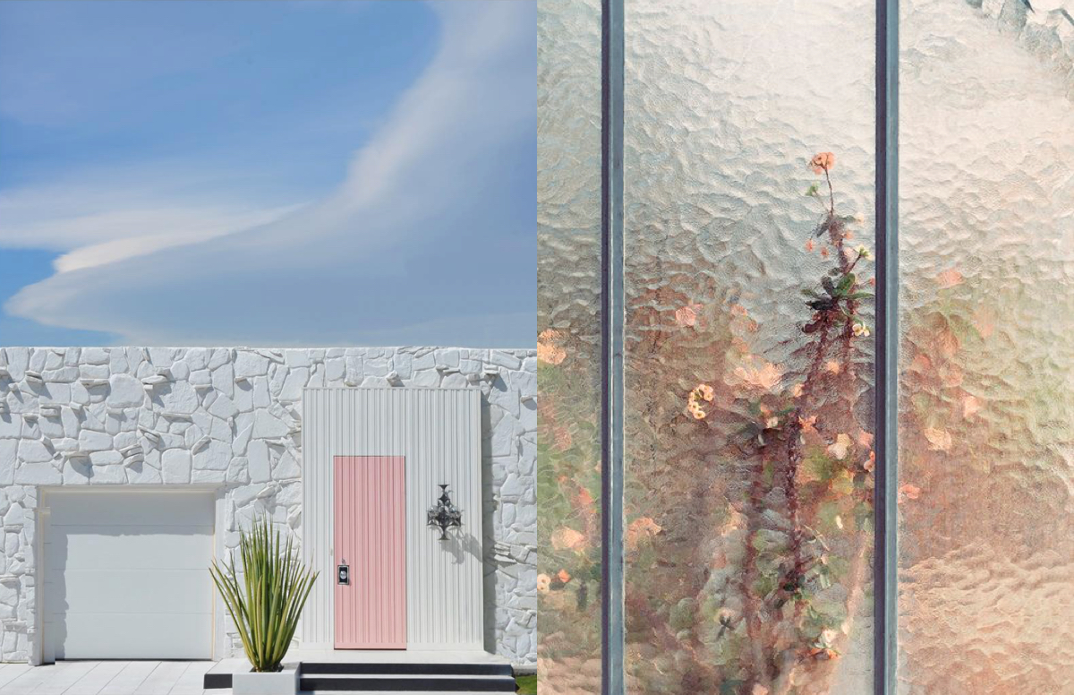
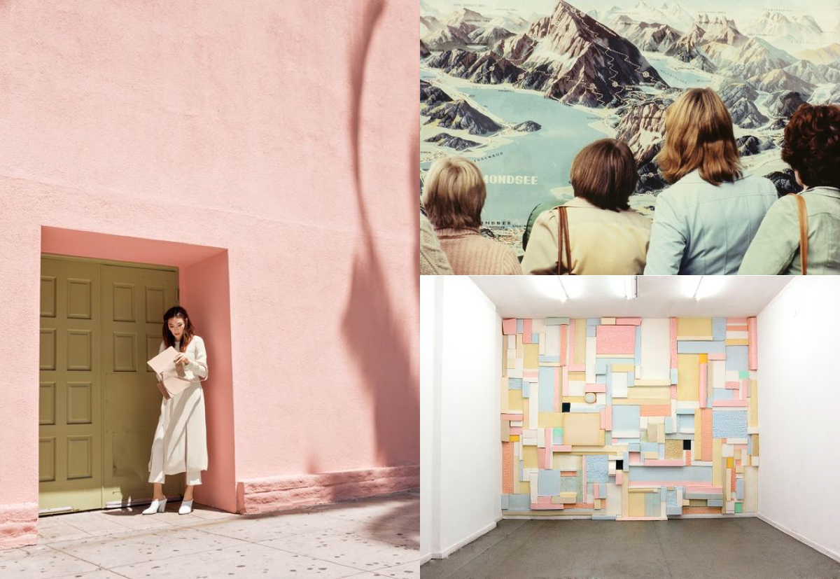
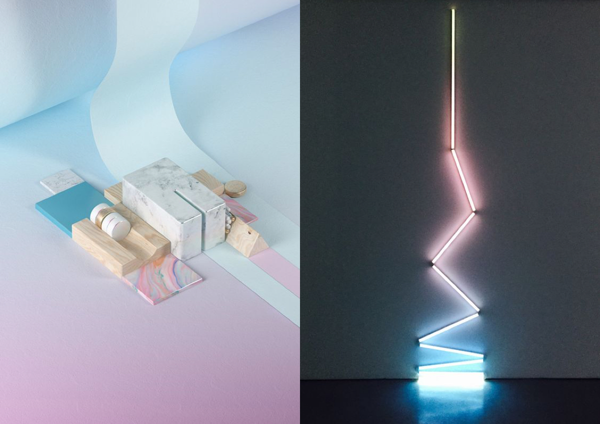
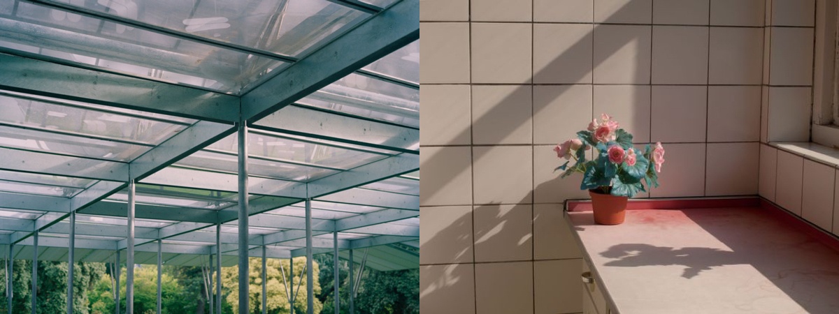
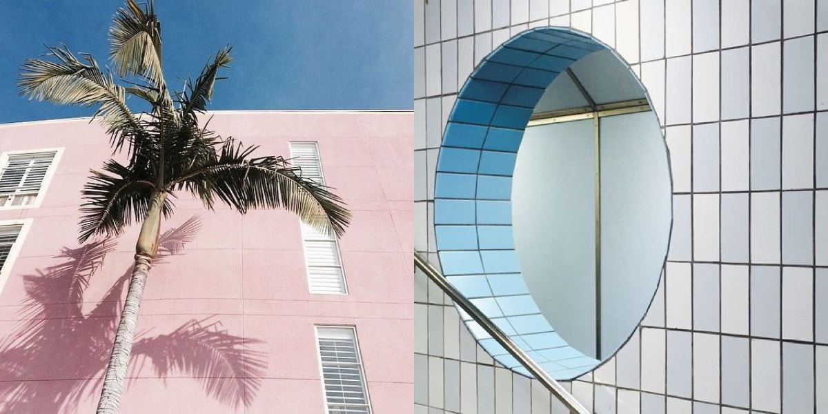
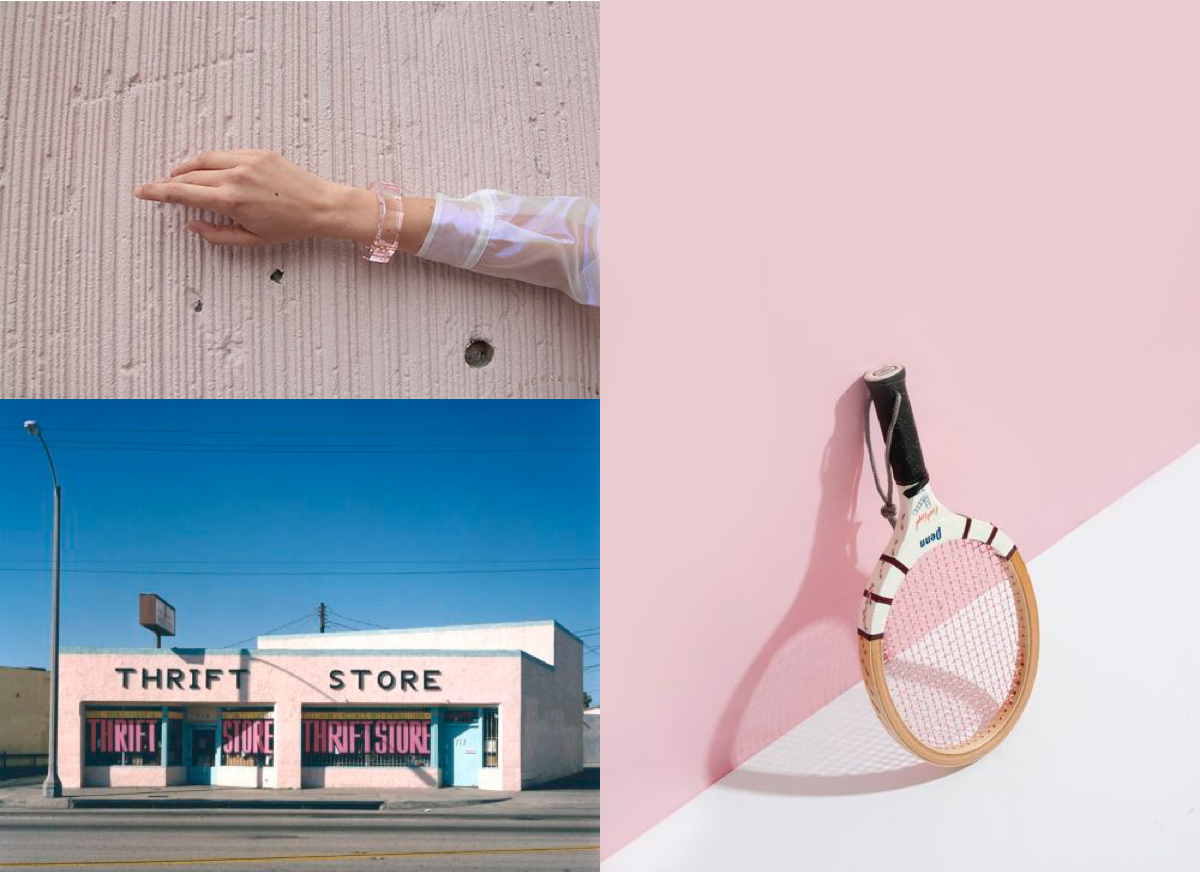
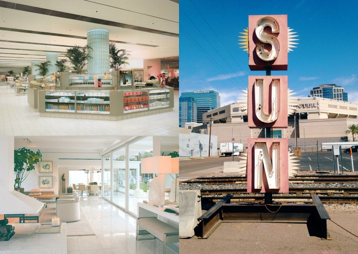
Source: infusedwithpastels
Join the LFB community! Use #theCLmovement on instagram and twitter
to have your content featured on LFB!

